Mobile Tower Defense Concept Planning, Focused on Preparation Experience

Introduction
This post is a concept plan!
One thing I learned from my previous project experience is that developing something over a long period of time also means getting entangled in a larger context. If handled poorly, the development process can end up being a tiring and painful experience, so I need to carefully deliberate and choose my subject wisely.
This concept design is something of an experiment in that context. First, I plan to spend about one to two months concretizing ideas for streamlining the development process — producing draft designs, writing documents, designing classes, and so on. Then, weighing various opportunity costs, I’ll either actually start developing the game or organize my thoughts along the way and write about them.
Why Tower Defense
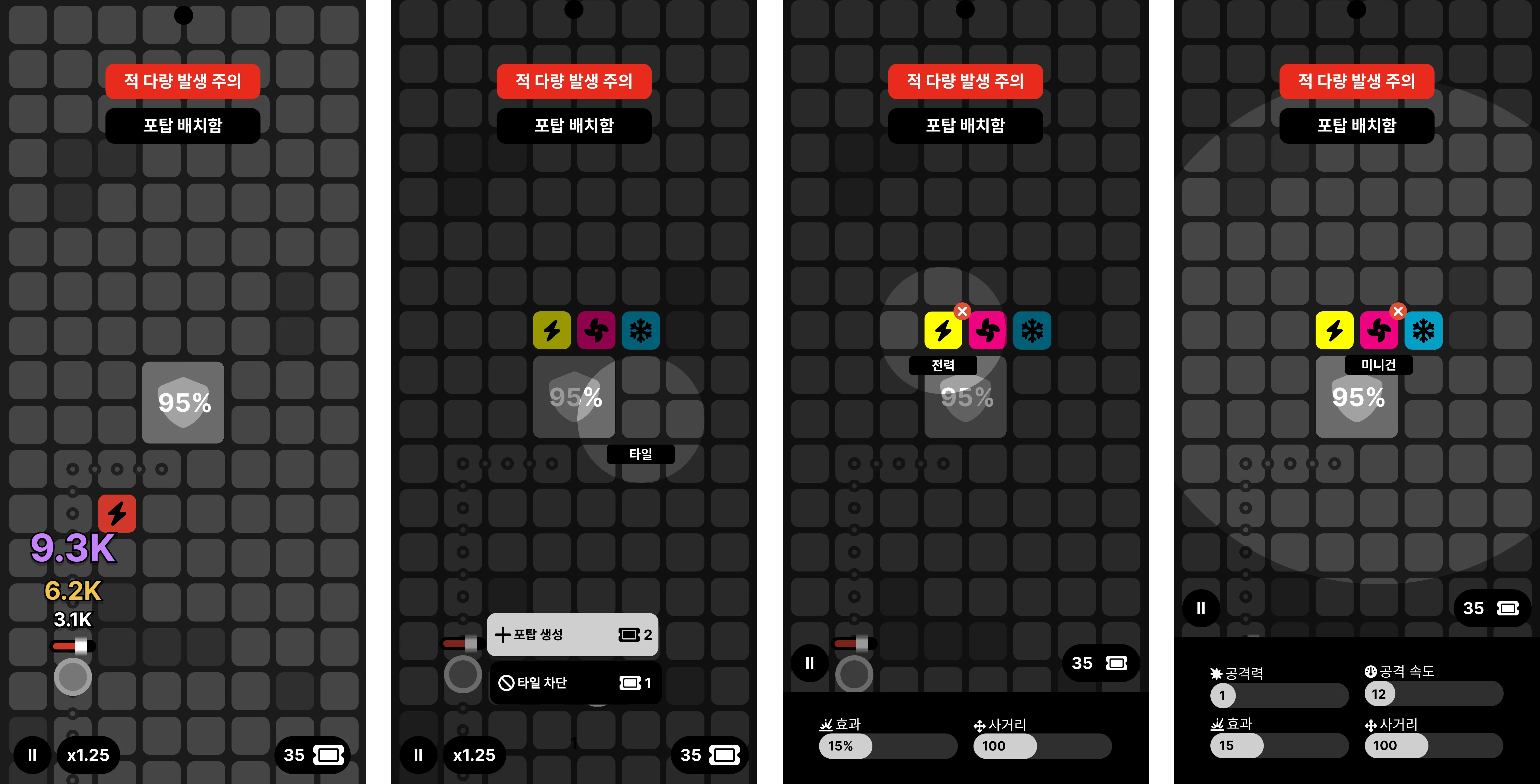 Gameplay and control example
The first reason I chose tower defense is that I’ve enjoyed this genre quite a bit, so it doesn’t feel unfamiliar. The second reason is that, by a similar logic, I think I’ll be able to sustain development with personal attachment. There are already many released tower defense games, so there’s a wealth of cases to reference.
However, there are downsides: competition is fierce, the genre has recently come across as somewhat old and static, and traditional tower defense structures make it hard to present game-over conditions in an impactful way. Similarly, it seems difficult to steer the game creatively.
How to compensate for these issues is the most important concern in concretizing this idea. One possible approach is to treat a certain number of rounds as a single session where the maximum reward is capped, and to give the player the option to end the current game and move on to a new one.
Minimalist Design Grammar
The design grammar of this concept game has two principles: minimalism and pragmatism. I prioritized minimalism for design consistency and development cost reduction, but I didn’t want to ignore pragmatism either. The problem was that reducing functionality often made it impractical, while conversely displaying too much information together frequently resulted in visual clutter and conflict. Most of the effort went into balancing these trade-offs.
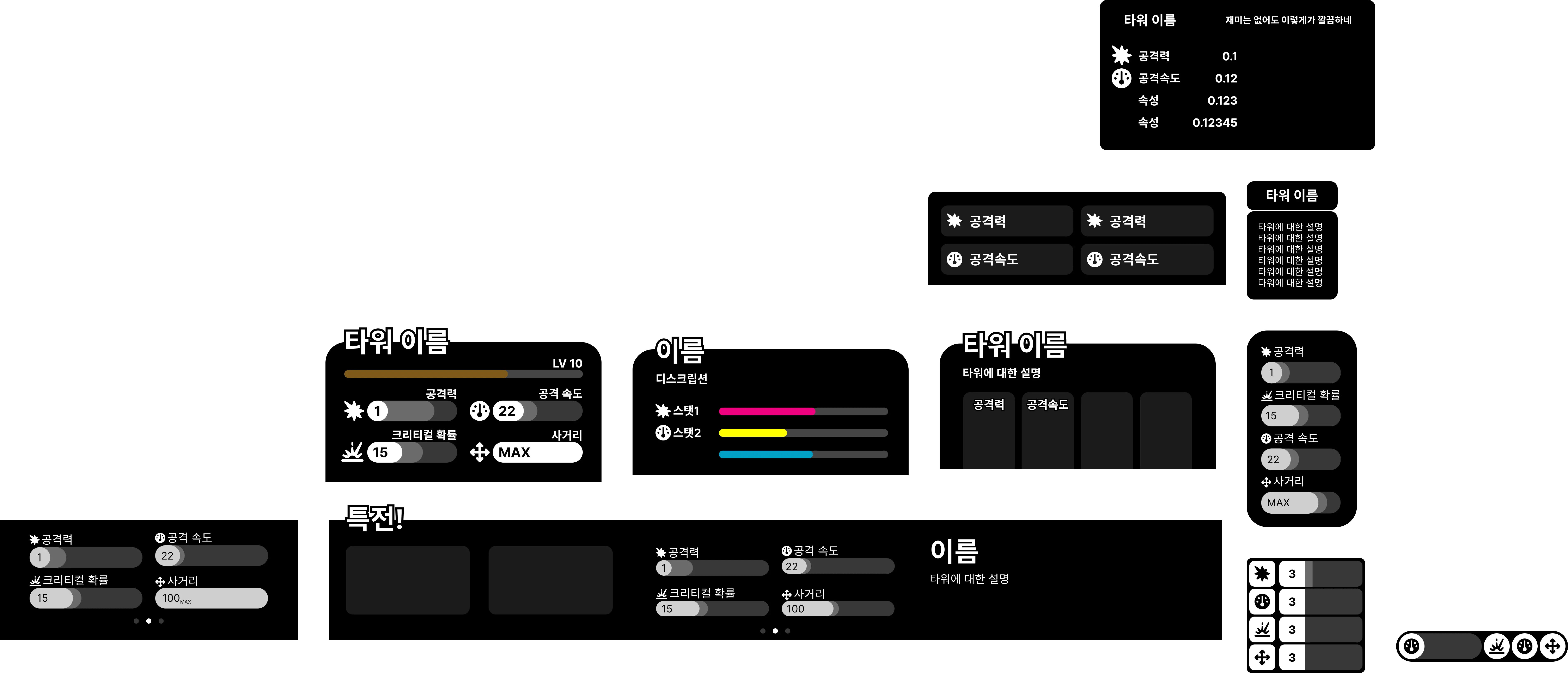 The most agonizing design — the tower info panel. Each version has its own problems.
Displaying detailed stats in the tower specification window makes the information density excessively high — like a receipt — while showing them concisely severely reduces intuitiveness. The root cause is that the tower data itself is voluminous and complex, and similar problems arose when designing many other UI elements. Since I can’t strip down the game system just for clean information display, I instead established the following self-imposed principles to find the best compromise:
- Both visual information density and temporal information density must be kept consistent. From both perspectives, information should neither be too abundant nor too scarce.
- The player’s choices must be intuitively felt. Even small actions should trigger dynamic UI responses through multiple layers of animation and effects.
- The UI must engage interest while preventing boredom. Not everything can be made dynamic, but to minimize static situations that cause boredom, the map and game systems should function flexibly within permitted limits.
 Four types of alerts triggered during gameplay
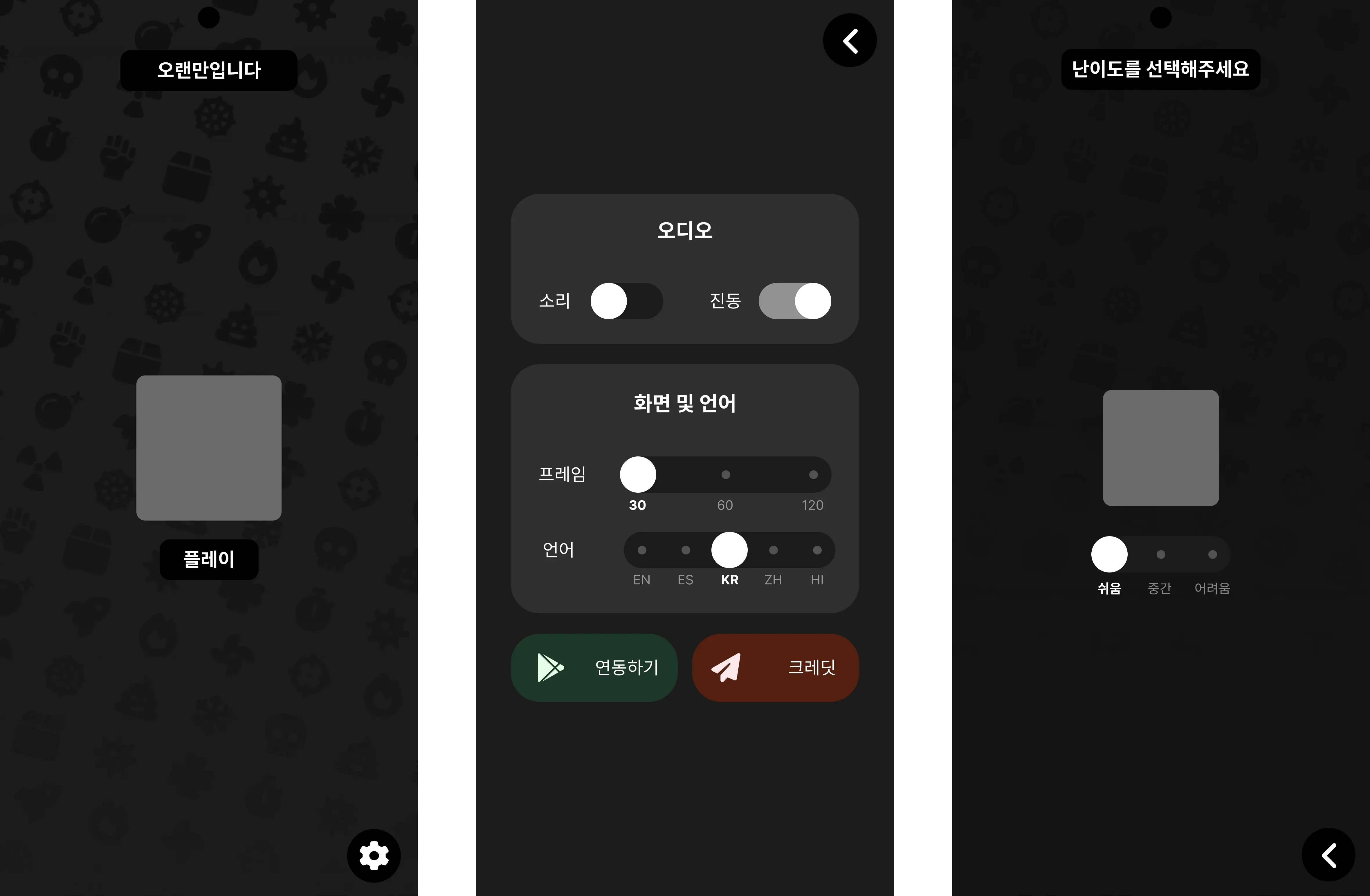 Main menu and settings screen. Icons are from Fontawesome.
Most UI functions and on-screen layouts were determined according to these pragmatic principles. The game’s black-and-white monochrome atmosphere and the largely static UI layout are downsides that need improvement through visual effects like animation.
Technical Considerations for Development
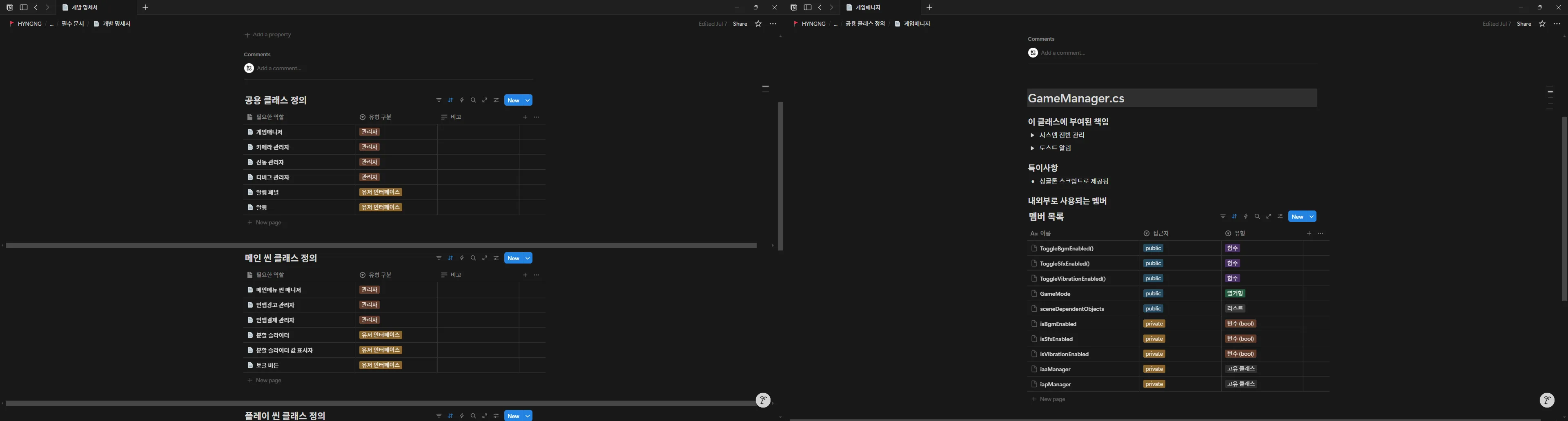
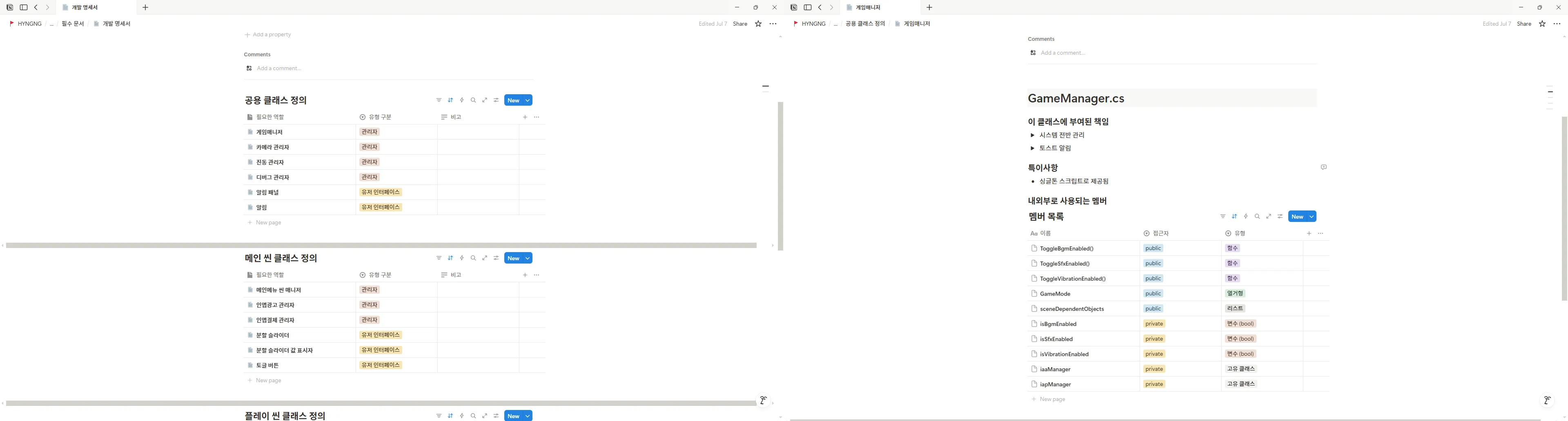 A Notion page I’m considering making public once it’s organized enough
The technical goals achievable through this project are not grandiose. Familiar concepts — naming conventions, SOLID principles, strategies for smooth project management, design patterns like singleton and event-driven programming, and Android core app quality standards — will be refined and implemented. When there’s room, I might try using one of the following:
- GPGS
- Object pooling
- Multithreading
- Unity Analytics
- Android toast notifications
- ISO/IEC 25010 Quality Characteristics
While working on the documentation, I happened to come across Awesome Lists, and among the Unity-related items, I found Nodulus — an open-source project worth referencing in detail. I had been struggling because I lacked a sense of how projects are actually managed, and this could be a great reference in terms of script structure, asset management, and more.